EN
React - own light SweetAlert2 implementation
9
points
In this short article, we would like to show how in React create its own light SweeAlert2 implementation.
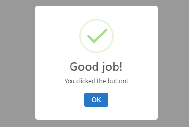
The presented solution displays five types of alerts:
- success,
- error,
- question,
- info,
- warning.
The main advantage of this approach is a small alert component size, e.g.:
- SweeAlert2 in min version has 14.9kB for js and 4.2kB for css files (link here).
- own light SweetAlert2 implementation has 5.39kB for the version with removed white characters only (min version is smaller).
Practical example:
// ONLINE-RUNNER:browser;

const coverStyle = {
    position: 'fixed',
    left: '0',
    top: '0',
    right: '0',
    bottom: '0',
    background: 'rgba(0, 0, 0, 0.4)',
    display: 'flex',
    zIndex: '1000'
};

const coverVisibleStyle = {
    ...coverStyle,
    filter: 'opacity(1)',
    transition: '0.2s all'
};

const coverHiddenStyle = {
    ...coverStyle,
    filter: 'opacity(0)',
    transition: '0.2s all'
};

const alertStyle = {
  	margin: 'auto',
    padding: '1.25em',
    border: 'none',
    borderRadius: '5px',
    background: '#fff',
    boxSizing: 'border-box',
    width: '250px',
    maxWidth: '100%',
    fontFamily: '"Open Sans", -apple-system, BlinkMacSystemFont, "Segoe UI", Roboto, Oxygen-Sans, Ubuntu, Cantarell, "Helvetica Neue", Helvetica, Arial, sans-serif',
    fontSize: '0.8rem'
};

const alertVisibleStyle = {
    ...alertStyle,
    transform: 'scale(1.0)',
    transition: '0.1s all'
};

const alertHiddenStyle = {
    ...alertStyle,
    transform: 'scale(0.4)',
    transition: '0.1s all'
};

const blockStyle = {
    padding: '0.8em 1.1em',
    textAlign: 'center'
};

const iconStyle = {
    margin: 0,
    width: '70px',
    height: '70px'
};

const titleStyle = {
    padding: '0 1.1em',
    textAlign: 'center',
    textTransform: 'none',
    wordWrap: 'break-word',
    fontSize: '1.875em',
    fontWeight: '600',
    color: '#595959'
};

const messageStyle = {
    padding: '0.5em 1.1em',
    textAlign: 'center',
    color: '#545454'
};

const buttonStyle = {
    padding: '0.5em 1.1em',
    border: '0',
    borderRadius: '0.25em',
    background: '#2778c4',
    fontSize: '1.0625em',
    fontWeight: '500',
    color: '#fff',
    cursor: 'pointer'
};

const OkIcon = props => (
    <svg xmlns="http://www.w3.org/2000/svg" viewBox="0 0 22.061 22.061" {...props}>
      <path fill="#e4f4da" d="M11.03 0A11.03 11.03 0 000 11.03a11.03 11.03 0 0011.03 11.03 11.03 11.03 0 0011.03-11.03A11.03 11.03 0 0011.03 0zm0 .985A10.046 10.046 0 0121.076 11.03 10.046 10.046 0 0111.03 21.076 10.046 10.046 0 01.984 11.03 10.046 10.046 0 0111.03.985z" />
      <path fill="#a5dc86" d="M17.187 6.123l-7.716 7.753-3.653-3.67c-.057-.054-.098-.035-.134.002l-.918.913c-.059.062-.029.09.008.13L9.47 15.97l8.747-8.789c.05-.048.038-.096.003-.133l-.92-.918c-.051-.048-.076-.042-.113-.008z" />
    </svg>
);

const ErrorIcon = props => (
    <svg xmlns="http://www.w3.org/2000/svg" viewBox="0 0 22.061 22.061" {...props}>
      <g fillOpacity={0.976} fill="#f27474">
        <path d="M11.03 0A11.03 11.03 0 000 11.03a11.03 11.03 0 0011.03 11.03 11.03 11.03 0 0011.03-11.03A11.03 11.03 0 0011.03 0zm0 .985A10.046 10.046 0 0121.076 11.03 10.046 10.046 0 0111.03 21.076 10.046 10.046 0 01.984 11.03 10.046 10.046 0 0111.03.985z" />
        <path d="M6.855 6.086l-.2.201a.48.48 0 000 .681l3.847 3.849-3.848 3.848a.48.48 0 000 .681l.201.201a.48.48 0 00.682 0l3.848-3.848 3.848 3.848a.48.48 0 00.682 0l.2-.2a.48.48 0 000-.682l-3.847-3.848 3.848-3.849a.48.48 0 000-.681l-.201-.201a.48.48 0 00-.682 0l-3.848 3.848-3.848-3.848c-.25-.204-.51-.155-.682 0z" />
      </g>
    </svg>
);

const QuestionIcon = props => (
    <svg xmlns="http://www.w3.org/2000/svg" viewBox="0 0 22.061 22.061" {...props}>
      <path fill="#c9dae1" d="M11.03 0A11.03 11.03 0 000 11.03a11.03 11.03 0 0011.03 11.03 11.03 11.03 0 0011.03-11.03A11.03 11.03 0 0011.03 0zm0 .985A10.046 10.046 0 0121.076 11.03 10.046 10.046 0 0111.03 21.076 10.046 10.046 0 01.984 11.03 10.046 10.046 0 0111.03.985z" />
      <path fill="#87adbd" d="M7.979 6.885c.703-.29 1.756-.549 2.7-.549 1.57 0 2.346.516 2.346 1.802 0 1.959-2.92 2.473-2.92 5.272v1.03h.98v-1.03c0-2.472 3.03-2.747 3.03-5.323 0-1.837-1.385-2.66-3.382-2.66-1.145 0-2.365.309-3.068.583zm2.625 8.912c-.462 0-.776.24-.776.67 0 .428.314.687.776.687.444 0 .74-.259.74-.687 0-.43-.296-.67-.74-.67z" />
    </svg>
);

const InfoIcon = props => (
    <svg xmlns="http://www.w3.org/2000/svg" viewBox="0 0 22.061 22.061" {...props}>
      <path fill="#9de0f6" d="M11.055-.023A11.018 11.032 0 00.036 11.01a11.018 11.032 0 0011.019 11.032A11.018 11.032 0 0022.073 11.01 11.018 11.032 0 0011.055-.023zm0 .985A10.035 10.048 0 0121.09 11.01a10.035 10.048 0 01-10.035 10.048A10.035 10.048 0 011.019 11.01 10.035 10.048 0 0111.055.962z" />
      <path fill="#3fc3ee" d="M10.435 8.925h1.204v8.258h-1.204z" />
      <ellipse cx={11.041} cy={6.66} rx={0.705} ry={0.819} fill="#3fc3ee" />
    </svg>
);

const WarningIcon = props => (
    <svg xmlns="http://www.w3.org/2000/svg" viewBox="0 0 22.061 22.061" {...props}>
      <path fill="#facea8" d="M11.055.34A11.018 10.85 0 00.036 11.19a11.018 10.85 0 0011.019 10.851 11.018 10.85 0 0011.018-10.85A11.018 10.85 0 0011.055.34zm0 .969A10.035 9.883 0 0121.09 11.19a10.035 9.883 0 01-10.035 9.883A10.035 9.883 0 011.019 11.19a10.035 9.883 0 0110.036-9.88z" />
      <path fill="#f8bb86" d="M11.672 6.208h-1.54l.384 7.723.743.001zM11.851 16.058a.936 1.026 0 01-.936 1.026.936 1.026 0 01-.936-1.026.936 1.026 0 01.936-1.026.936 1.026 0 01.936 1.026z" />
    </svg>
);

const iconTypes = {
    'success': OkIcon,
    'error': ErrorIcon,
    'question': QuestionIcon,
    'info': InfoIcon,
    'warning': WarningIcon
};

const SweetAlert2Light = ({
    visible,
    type = 'success',
    title,
    message,
    buttons = ['OK'],
    onClose
}) => {
    const [localVisible, setLocalVisible] = React.useState(false);
    const [alertRemoved, setAlertRemoved] = React.useState(visible === false);
    React.useEffect(() => {
        if (visible) {
            setLocalVisible(false);
            setAlertRemoved(false);
        }
        const handle = setTimeout(() => setLocalVisible(visible), 100);
        return () => clearTimeout(handle);
    }, [visible]);
    if (alertRemoved) {
      	return null;
    }
    const handleTransitionEnd = () => {
        if (localVisible === false) {
          	setAlertRemoved(true);
        }
    };
    const coverStyle = localVisible ? coverVisibleStyle : coverHiddenStyle;
    const alertStyle = localVisible ? alertVisibleStyle : alertHiddenStyle;
    const Icon = iconTypes[type];
    return ReactDOM.createPortal(
        <div style={coverStyle} onTransitionEnd={handleTransitionEnd}>
          <div style={alertStyle}>
            <div style={blockStyle}>
              <Icon style={iconStyle} />
            </div>
            <div style={titleStyle}>{title}</div>
            <div style={messageStyle}>{message}</div>
            <div style={blockStyle}>
              {buttons.map((button, index) => {
                  const handleClick = () => onClose(button);
                  return (
                      <a key={button}>
                        {index > 0 && ' '}
                        <button style={buttonStyle} onClick={handleClick}>
                          {button}
                        </button>
                      </a>
                  );
              })}
            </div>
          </div>
        </div>,
        document.body
    );
};

// Usage example:

const App = () => {
    const [alertType, setAlertType] = React.useState(null);
    const handleClose = (button) => {
        console.log(`Button '${button}' clicked.`);
        setAlertType(null);
    };
    return (
        <div style={{ height: '300px' }}>
          <button onClick={() => setAlertType('success')}>Show success alert</button>{' '}
          <button onClick={() => setAlertType('error')}>Show error alert</button>{' '}
          <button onClick={() => setAlertType('question')}>Show question alert</button>{' '}
          <button onClick={() => setAlertType('info')}>Show info alert</button>{' '}
          <button onClick={() => setAlertType('warning')}>Show warning alert</button>
          <SweetAlert2Light
            visible={alertType === 'success'}
            type="success"
            title="Good job!"
            message="You clicked the button!"
            onClose={handleClose}
          />
          <SweetAlert2Light
            visible={alertType === 'error'}
            type="error"
            title="Operation error!"
            message="Operation will be repeated!"
            onClose={handleClose}
          />
          <SweetAlert2Light
            visible={alertType === 'question'}
            type="question"
            title="Overwriting the file"
            message="Do you want to continue?"
            buttons={['Yes', 'No']}
            onClose={handleClose}
          />
          <SweetAlert2Light
            visible={alertType === 'info'}
            type="info"
            title="You just clicked on a button"
            onClose={handleClose}
          />
          <SweetAlert2Light
            visible={alertType === 'warning'}
            type="warning"
            title="File removing!"
            message="Do you want to do it?"
            buttons={['Yes', 'No']}
            onClose={handleClose}
          />
        </div>
    );
};


const root = document.querySelector('#root');
ReactDOM.render(<App />, root);