EN
CSS - specify flex items direction
0
points
In this article, we would like to show you how to specify flex items direction in CSS.
Quick solution:
.container {
  display: flex;
  flex-direction: row-reverse;
}
Practical example
In this example, we define the direction flex items are placed along the main axis in the flex container using flexbox flex-direction property.
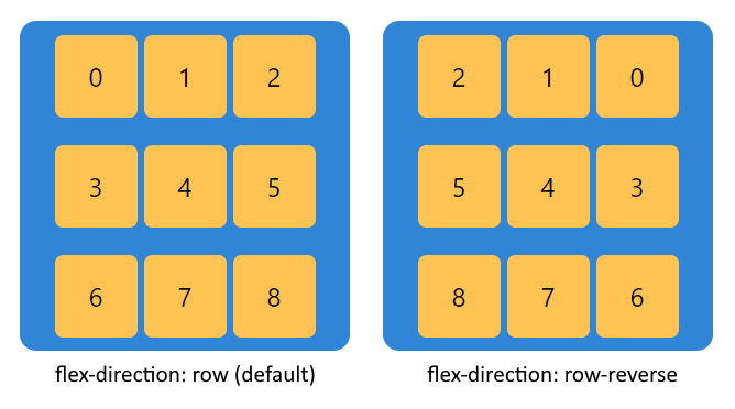
1. Row
// ONLINE-RUNNER:browser;

<!doctype html>
<html>
  <head>
    <style>

      .container {
        background-color: #3085d6;
        height: 200px;
        width: 200px;
        border-radius: 10px;
        box-shadow: 5px 5px 15px gray;
        align-items: center;
        justify-content: center;
        flex-wrap: wrap;

        display: flex;			/*		<----- required			*/
        flex-direction: row;	/*		<----- required			*/
      }

      .item {
        height: 50px;
        width: 50px;
        margin: 2px;
        background-color: rgb(255, 195, 83);
        box-shadow: 1px 1px 2px black;
        border: 1px solid black;
        border-radius: 5px;
        text-align: center;
        line-height: 50px;
      }

    </style>
  </head>
  <body>
    <div class="container">
      <div class="item">0</div>
      <div class="item">1</div>
      <div class="item">2</div>
      <div class="item">3</div>
      <div class="item">4</div>
      <div class="item">5</div>
      <div class="item">6</div>
      <div class="item">7</div>
      <div class="item">8</div>
    </div>
  </body>
</html>
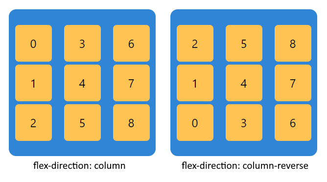
2. Column
// ONLINE-RUNNER:browser;

<!doctype html>
<html>
  <head>
    <style>

      .container {
        background-color: #3085d6;
        height: 200px;
        width: 200px;
        border-radius: 10px;
        box-shadow: 5px 5px 15px gray;
        align-items: center;
        justify-content: center;
        flex-wrap: wrap;

        display: flex;			    /*		<----- required			*/
        flex-direction: column; 	/*		<----- required			*/
      }

      .item {
        height: 50px;
        width: 50px;
        margin: 2px;
        background-color: rgb(255, 195, 83);
        box-shadow: 1px 1px 2px black;
        border: 1px solid black;
        border-radius: 5px;
        text-align: center;
        line-height: 50px;
      }

    </style>
  </head>
  <body>
    <div class="container">
      <div class="item">0</div>
      <div class="item">1</div>
      <div class="item">2</div>
      <div class="item">3</div>
      <div class="item">4</div>
      <div class="item">5</div>
      <div class="item">6</div>
      <div class="item">7</div>
      <div class="item">8</div>
    </div>
  </body>
</html>