EN
CSS - text-overflow: ellipsis with nested display: flex elements
6
points
In this article, we're going to have a look at how to in a simple way in pure CSS cut overflowing text for multiple nested elements with flex-box.
Quick solution:
// ONLINE-RUNNER:browser;

<style>

    .parent-fix {           /*  with display: flex; styled element   */
    	min-width: 0;
    }

    .text-shortcut {        /*  with display: block; styled element  */
      	text-overflow: ellipsis;
        white-space: nowrap;
        overflow: hidden;
    }

</style>

<div style="width: 100px; display: flex">
  <div class="parent-fix" style="display: flex">
    <div class="text-shortcut">
      Very long text here, Very long text here, Very long text here
    </div>
  </div>
</div>
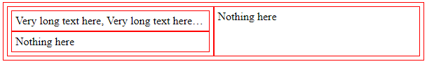
A more complicated practical example
A verry common problem when we try to make CSS shortcut for text is: when we try to combine flex-box layout (display: flex;) with text-overflow: ellipsis.
The solution for this problem is to use min-width: 0 for parent element that we want to shortcut text.
Note: when
div.shortcutelement will be in flex-box mode (display: flex),text-overflow: ellipsiswill be not working.Conclusion: use
ellipsisalways with block element, wrapping text with aditional element when it is necessary.
// ONLINE-RUNNER:browser;

<!doctype html>
<html>
<head>
  <style>

    div { padding: 5px; border: 1px solid red; }

    div.h-container { display: flex; }
    div.v-container { display: flex; flex-direction: column; }
    div.item { flex: 1; }

    div.fix {
    	min-width: 0; /* <--------------- required */
    }

    div.shortcut  {
      	text-overflow: ellipsis; /* <---- required */
        white-space: nowrap; /* <-------- required */
        overflow: hidden; /* <----------- required */
    }

  </style>
</head>
<body>
  <div class="h-container">
    <!-                          |fix here (for flex element)                   ->
    <!-                          v                                              ->
    <div class="item v-container fix">
      <div class="item shortcut">  <!- ---------- shortcut here (block element) ->
        Very long text here, Very long text here,
        Very long text here, Very long text here
      </div>
      <div class="item">
        Nothing here
      </div>
    </div>
    <div class="item">
      Nothing here
    </div>
  </div>
</body>
</html>