EN
CSS - justify content in flexbox (flex-direction: column)
4
points
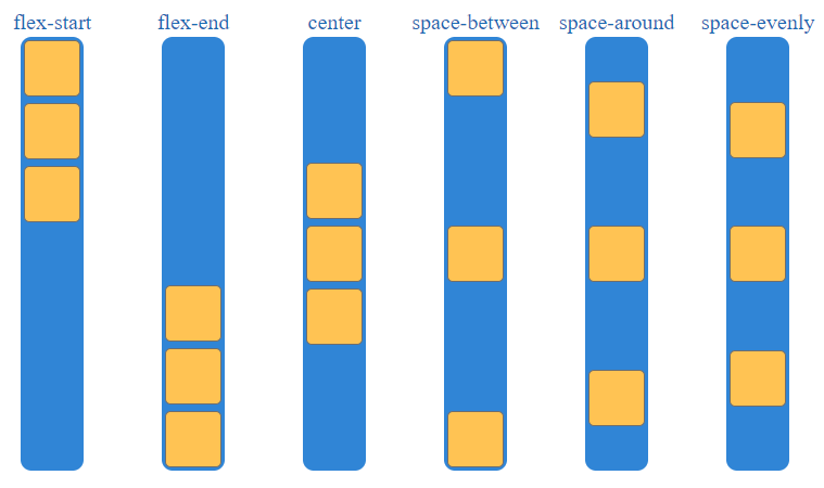
In this article, we would like to show you how to justify content inside flex container in CSS, when flex-direction is set to column.
Note: to see the same effect in row flex direction check this article.
Overview
Working with flexbox, we can set justify-content property to the following values:
flex-startflex-endcenterspace-betweenspace-aroundspace-evenly
Following property organize items in the following way when flex-direction style property is set to column value.
Practical examples
1. flex-start
// ONLINE-RUNNER:browser;

<!doctype html>
<html>
<head>
  <style>

	.container {
		margin: 2px auto 0 auto;
		border-radius: 10px;
		background: #3085d6;
		width: 58px;
		height: 400px;
		display: flex;                  /*  <-------------- required               */
		flex-direction: column;         /*  <-------------- required               */
		justify-content: flex-start;    /*  <-------------- required               */
	}

	.item {
		margin: 3px;
		border: 1px solid #6e6e6e;
		border-radius: 5px;
		background: #ffc353;
		height: 50px;
		width: 50px;
	}

  </style>
</head>
<body>
  <div class="container">
    <div class="item"></div>
    <div class="item"></div>
    <div class="item"></div>
  </div>
</body>
</html>
2. flex-end
// ONLINE-RUNNER:browser;

<!doctype html>
<html>
<head>
  <style>

	.container {
		margin: 2px auto 0 auto;
		border-radius: 10px;
		background: #3085d6;
		width: 58px;
		height: 400px;
		display: flex;                  /*  <-------------- required               */
		flex-direction: column;         /*  <-------------- required               */
		justify-content: flex-end;      /*  <-------------- required               */
	}

	.item {
		margin: 3px;
		border: 1px solid #6e6e6e;
		border-radius: 5px;
		background: #ffc353;
		height: 50px;
		width: 50px;
	}

  </style>
</head>
<body>
  <div class="container">
    <div class="item"></div>
    <div class="item"></div>
    <div class="item"></div>
  </div>
</body>
</html>
3. center
// ONLINE-RUNNER:browser;

<!doctype html>
<html>
<head>
  <style>

	.container {
		margin: 2px auto 0 auto;
		border-radius: 10px;
		background: #3085d6;
		width: 58px;
		height: 400px;
		display: flex;                  /*  <-------------- required               */
		flex-direction: column;         /*  <-------------- required               */
		justify-content: center;        /*  <-------------- required               */
	}

	.item {
		margin: 3px;
		border: 1px solid #6e6e6e;
		border-radius: 5px;
		background: #ffc353;
		height: 50px;
		width: 50px;
	}

  </style>
</head>
<body>
  <div class="container">
    <div class="item"></div>
    <div class="item"></div>
    <div class="item"></div>
  </div>
</body>
</html>
4. space-between
// ONLINE-RUNNER:browser;

<!doctype html>
<html>
<head>
  <style>

	.container {
		margin: 2px auto 0 auto;
		border-radius: 10px;
		background: #3085d6;
		width: 58px;
		height: 400px;
		display: flex;                  /*  <-------------- required               */
		flex-direction: column;         /*  <-------------- required               */
		justify-content: space-between; /*  <-------------- required               */
	}

	.item {
		margin: 3px;
		border: 1px solid #6e6e6e;
		border-radius: 5px;
		background: #ffc353;
		height: 50px;
		width: 50px;
	}

  </style>
</head>
<body>
  <div class="container">
    <div class="item"></div>
    <div class="item"></div>
    <div class="item"></div>
  </div>
</body>
</html>
5. space-around
// ONLINE-RUNNER:browser;

<!doctype html>
<html>
<head>
  <style>

	.container {
		margin: 2px auto 0 auto;
		border-radius: 10px;
		background: #3085d6;
		width: 58px;
		height: 400px;
		display: flex;                  /*  <-------------- required               */
		flex-direction: column;         /*  <-------------- required               */
		justify-content: space-around;  /*  <-------------- required               */
	}

	.item {
		margin: 3px;
		border: 1px solid #6e6e6e;
		border-radius: 5px;
		background: #ffc353;
		height: 50px;
		width: 50px;
	}

  </style>
</head>
<body>
  <div class="container">
    <div class="item"></div>
    <div class="item"></div>
    <div class="item"></div>
  </div>
</body>
</html>
6. space-evenly
// ONLINE-RUNNER:browser;

<!doctype html>
<html>
<head>
  <style>

	.container {
		margin: 2px auto 0 auto;
		border-radius: 10px;
		background: #3085d6;
		width: 58px;
		height: 400px;
		display: flex;                  /*  <-------------- required               */
		flex-direction: column;         /*  <-------------- required               */
		justify-content: space-evenly;  /*  <-------------- required               */
	}

	.item {
		margin: 3px;
		border: 1px solid #6e6e6e;
		border-radius: 5px;
		background: #ffc353;
		height: 50px;
		width: 50px;
	}

  </style>
</head>
<body>
  <div class="container">
    <div class="item"></div>
    <div class="item"></div>
    <div class="item"></div>
  </div>
</body>
</html>