EN
CSS - div box with arrow in pure CSS
4
points
In this short article, we would like to show how to make div box with arrow in pure CSS.
Solution 1
Presented solution uses some trick, that allows to set triangle shape for div elements. The trick bases on 2 divs where one has border and is rotated using 45 degrees and second one cuts first one it giving triangle effect, what was presented in the below.
// ONLINE-RUNNER:browser;
<!doctype html>
<html>
<body>
<style>
body {
margin: 0; /* <------------------------------------------- optional */
padding: 20px; /* <--------------------------------------- optional */
}
/* --- solution --- */
div.box {
position: relative;
width: 210px; /* <---------------------------------------- optional */
}
div.arrow {
position: absolute;
top: -9px; right: 33px;
width: 19px; height: 10px;
overflow: hidden;
}
div.arrow::after {
position: relative;
top: 3px; left: 3px;
border: 1px rgba(0, 0, 0, 0.15);
border-style: solid none none solid;
background: white;
width: 12px; height: 12px;
display: block;
transform: rotate(45deg);
content: '';
}
div.content {
padding: 10px; /* <--------------------------------------- optional */
border: 1px solid rgba(0, 0, 0, 0.15);
border-radius: 0.25rem; /* <------------------------------ optional */
background: white;
box-shadow: 0 1px 3px rgba(200, 200, 200, 0.7); /* <------ optional */
overflow: hidden; /* <------------------------------------ optional */
}
</style>
<div class="box">
<div class="arrow"></div>
<div class="content">
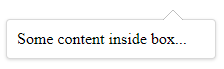
Some content inside box...
</div>
</div>
</body>
</html>
Solution 2
Presented solution uses some trick, that allows to set triangle shape for div elements. That divs are used later with absolute position as triangle with proper box. Using two triangle divs makes possible to ad additional border for arrows, what was presented in the below.
Quick solution:
// ONLINE-RUNNER:browser;

<!doctype html>
<html>
<body>
  <style>

    body {
      	margin: 0;  /* <------------------------------------------- optional */
      	padding: 20px;  /* <--------------------------------------- optional */
    }

    /* --- solution --- */

    div.box {
      	position: relative;
      	width: 210px;  /* <---------------------------------------- optional */
    }

    div.arrow-border {
        position: absolute;
        top: -9px; right: 33px;
        border-left: 10px solid transparent;
        border-right: 10px solid transparent;
        border-bottom: 10px solid black;
        width: 0; height: 0;
    }

    div.arrow-background {
        position: absolute;
        left: -10px; top: 0;
        border-left: 10px solid transparent;
        border-right: 10px solid transparent;
        border-bottom: 10px solid white;
        width: 0; height: 0;
    }

    div.content {
      	padding: 10px;  /* <--------------------------------------- optional */
      	border: 1px solid rgba(0, 0, 0, 0.15);
        border-radius: 0.25rem;  /* <------------------------------ optional */
        box-shadow: 0 1px 3px rgba(200, 200, 200, 0.7);  /* <------ optional */
        overflow: hidden;  /* <------------------------------------ optional */
    }

  </style>
  <div class="box">
    <div class="arrow-border">
      <div class="arrow-background"></div>
    </div>
    <div class="content">
      Some content inside box...
    </div>
  </div>
</body>
</html>