EN
CSS - responsive styles for desktop and mobile (desktop first approach)
4
points
In this short article, we want to show how to create responsive desktop and mobile styles for a simple page layout using @media queries in CSS.
The below example uses a desktop-first approach - it means at first we have created styles for desktop and later some of them were overwritten using @media block to achieve mobile styles.
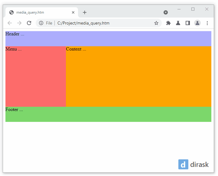
Note: run the below example and change the web browser window size to smaller - you will see the effect.
Practical example:
// ONLINE-RUNNER:browser;

<!doctype html>
<html>
<head>
  <style>

	/* Desktop first approach */

	/* Default styles for Desktop */

    div.header {
    	background: #adadff;
      	height: 50px;
    }

    div.container {
      	height: 200px;
      	display: flex;
    }

    div.menu {
    	background: #ff6b6b;
      	flex: 0 0 200px;
    }

    div.content {
    	background: orange;
      	flex: auto;
    }

    div.footer {
    	background: #7dd96d;
      	height: 50px;
    }

	/* Mobile styles for screen width <= 550px */

	@media (max-width: 550px)
	{
		/* below styles overwrite desktop styles */

		div.container {
			height: auto;
			display: block;
		}

		div.menu {
			flex: none;
			height: 50px;
		}

		div.content {
			flex: none;
			height: 300px;
		}
	}

  </style>
</head>
<body>
  <div class="header">Header ...</div>
  <div class="container">
    <div class="menu">Menu ...</div>
    <div class="content">Content ...</div>
  </div>
  <div class="footer">Footer ...</div>
</body>
</html>