EN
HTML / CSS - how to set cells borders inside grid to have the same width?
1
answers
3
points
I want to add borders of the same width to all cells inside my grid. How can I get rid of multiplying borders?
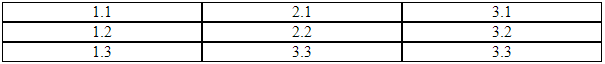
What I have:
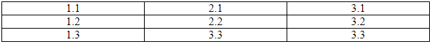
What I want:
I've tried to modify the solution below using box-sizing to have borders of the same width in a whole grid, but it didn't work.
My code:
// ONLINE-RUNNER:browser;

<!DOCTYPE html>
<html>
<head>
  <style>

    .grid {
        display: flex;
    }

    .column {
        flex: 1;
    }

    .cell{
        border: 1px solid;
        text-align: center;
    }

  </style>
</head>
<body>
  <div class="grid">
    <div class="column">
      <div class="cell">1.1</div>
      <div class="cell">1.2</div>
      <div class="cell">1.3</div>
    </div>
    <div class="column">
      <div class="cell">2.1</div>
      <div class="cell">2.2</div>
      <div class="cell">3.3</div>
    </div>
    <div class="column">
      <div class="cell">3.1</div>
      <div class="cell">3.2</div>
      <div class="cell">3.3</div>
    </div>
  </div>
</body>
</html>
Note:
The code is based on the following article: HTML - create grid using flexbox
1 answer
3
points
There's a simple trick to achieve this:
1. Set border-top and border-left properties of the whole grid.

2. Set border-right and border-bottom of your cells.
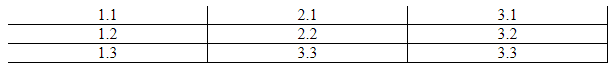
3. The two above together will give you a pretty border.

Practical example
// ONLINE-RUNNER:browser;

<!DOCTYPE html>
<html>
<head>
  <style>

    .grid {
        display: flex;
        border-top: 1px solid;  /*   <--- required  */
        border-left: 1px solid; /*   <--- required  */
    }

    .column {
        flex: 1;
    }

    .cell {
        text-align: center;
        border-right: 1px solid;  /*   <--- required  */
        border-bottom: 1px solid; /*   <--- required  */
    }

  </style>
</head>
<body>
  <div class="grid">
    <div class="column">
      <div class="cell">1.1</div>
      <div class="cell">1.2</div>
      <div class="cell">1.3</div>
    </div>
    <div class="column">
      <div class="cell">2.1</div>
      <div class="cell">2.2</div>
      <div class="cell">3.3</div>
    </div>
    <div class="column">
      <div class="cell">3.1</div>
      <div class="cell">3.2</div>
      <div class="cell">3.3</div>
    </div>
  </div>
</body>
</html>
0 comments
Add comment