EN
CSS - style radio button (HTML element)
3
points
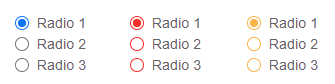
In this article, we would like to show you how to style radio button using CSS.
Practical example
In this example, we use :checked pseudo class to switch between .default and .checked style changing SVG icon when the radio button is clicked.
In the below source code, you can configure own colors by changing:
#5f6368- label font color#767676- icon border color (unchecked state)#ffffff- icon filling color (unchecked state)
icon ring color (checked state)#0075ff- icon circle color (checked state)
Source code:
// ONLINE-RUNNER:browser;

<!doctype html>
<html>
<head>
  <style>

    label.radio {
        cursor: pointer;
    }

    svg.icon {
        width: 13px;
        height: 13px;
        vertical-align: middle;
    }

    svg.icon.default {
        display: inline-block;
    }

    svg.icon.checked {
        display: none;
    }

    input.input:checked~svg.icon.default {
        display: none;
    }

    input.input:checked~svg.icon.checked {
        display: inline-block;
    }

    span.label {
        margin: 0 0 0 3px;
        vertical-align: middle;
        font: 13px Arial;
        color: #5f6368;
    }

  </style>
</head>
<body>
  <label class="radio">
    <input class="input" style="display: none" type="radio" />
    <!--
        You can add the following attributes to the input radio element:
          - name="field-name"
          - value="field-value"
          - checked (or: checked="checked")
    -->
    <svg class="icon default" xmlns="http://www.w3.org/2000/svg" viewBox="0 0 17.105 17.105">
      <circle style="fill: #767676" cx="8.552" cy="8.552" r="8.552" />
      <circle style="fill: #ffffff" cx="8.552" cy="8.552" r="7.35" />
    </svg>
    <svg class="icon checked" xmlns="http://www.w3.org/2000/svg" viewBox="0 0 17.105 17.105">
      <circle style="fill: #0075ff" cx="8.552" cy="8.552" r="8.552" />
      <circle style="fill: #ffffff" cx="8.552" cy="8.552" r="7.35" />
      <circle style="fill: #0075ff" cx="8.552" cy="8.552" r="5.023" />
    </svg>
    <span class="label">Label</span>
  </label>
</body>
</html>
Multiple radio buttons
In this example, we create two radio buttons that are assigned to the same group by common name.
// ONLINE-RUNNER:browser;

<!doctype html>
<html>
<head>
  <style>

    label.radio {
        cursor: pointer;
    }

    svg.icon {
        width: 13px;
        height: 13px;
        vertical-align: middle;
    }

    svg.icon.default {
        display: inline-block;
    }

    svg.icon.checked {
        display: none;
    }

    input.input:checked~svg.icon.default {
        display: none;
    }

    input.input:checked~svg.icon.checked {
        display: inline-block;
    }

    span.label {
        margin: 0 0 0 3px;
        vertical-align: middle;
        font: 13px Arial;
        color: #5f6368;
    }

  </style>
</head>
<body>
  Gender:
  <br />
  <!-- 1st radio -->
  <label class="radio">
    <input class="input" style="display: none" name="gender" type="radio" />
    <svg class="icon default" xmlns="http://www.w3.org/2000/svg" viewBox="0 0 17.105 17.105">
      <circle style="fill: #767676" cx="8.552" cy="8.552" r="8.552" />
      <circle style="fill: #ffffff" cx="8.552" cy="8.552" r="7.35" />
    </svg>
    <svg class="icon checked" xmlns="http://www.w3.org/2000/svg" viewBox="0 0 17.105 17.105">
      <circle style="fill: #0075ff" cx="8.552" cy="8.552" r="8.552" />
      <circle style="fill: #ffffff" cx="8.552" cy="8.552" r="7.35" />
      <circle style="fill: #0075ff" cx="8.552" cy="8.552" r="5.023" />
    </svg>
    <span class="label">Male</span>
  </label>
  <!-- END: 1st radio -->
  <br />
  <!-- 2nd radio -->
  <label class="radio">
    <input class="input" style="display: none" name="gender" type="radio" />
    <svg class="icon default" xmlns="http://www.w3.org/2000/svg" viewBox="0 0 17.105 17.105">
      <circle style="fill: #767676" cx="8.552" cy="8.552" r="8.552" />
      <circle style="fill: #ffffff" cx="8.552" cy="8.552" r="7.35" />
    </svg>
    <svg class="icon checked" xmlns="http://www.w3.org/2000/svg" viewBox="0 0 17.105 17.105">
      <circle style="fill: #0075ff" cx="8.552" cy="8.552" r="8.552" />
      <circle style="fill: #ffffff" cx="8.552" cy="8.552" r="7.35" />
      <circle style="fill: #0075ff" cx="8.552" cy="8.552" r="5.023" />
    </svg>
    <span class="label">Female</span>
  </label>
  <!-- END: 2nd radio -->
</body>
</html>
Multiple radio buttons (with SVG components)
In this example, we use SVG components to avoid icons source code duplications.
// ONLINE-RUNNER:browser;

<!doctype html>
<html>
<head>
  <style>

    label.radio {
        cursor: pointer;
    }

    svg.icon {
        width: 13px;
        height: 13px;
        vertical-align: middle;
    }

    svg.icon.default {
        display: inline-block;
    }

    svg.icon.checked {
        display: none;
    }

    input.input:checked~svg.icon.default {
        display: none;
    }

    input.input:checked~svg.icon.checked {
        display: inline-block;
    }

    span.label {
        margin: 0 0 0 3px;
        vertical-align: middle;
        font: 13px Arial;
        color: #5f6368;
    }

  </style>
</head>
<body>
  <!-- SVG components definition -->
  <svg style="display: none">
    <symbol viewBox="0 0 17.105 17.105" id="input-radio-default">
      <circle style="fill: #767676" cx="8.552" cy="8.552" r="8.552" />
      <circle style="fill: #ffffff" cx="8.552" cy="8.552" r="7.35" />
    </symbol>
    <symbol viewBox="0 0 17.105 17.105" id="input-radio-checked">
      <circle style="fill: #0075ff" cx="8.552" cy="8.552" r="8.552" />
      <circle style="fill: #ffffff" cx="8.552" cy="8.552" r="7.35" />
      <circle style="fill: #0075ff" cx="8.552" cy="8.552" r="5.023" />
    </symbol>
  </svg>
  <!-- END: SVG components definition -->
  Gender:
  <br />
  <!-- 1st radio -->
  <label class="radio">
    <input class="input" style="display: none" name="gender" type="radio" />
    <svg class="icon default" xmlns="http://www.w3.org/2000/svg">
      <use href="#input-radio-default" />
    </svg>
    <svg class="icon checked" xmlns="http://www.w3.org/2000/svg">
      <use href="#input-radio-checked" />
    </svg>
    <span class="label">Male</span>
  </label>
  <!-- END: 1st radio -->
  <br />
  <!-- 2nd radio -->
  <label class="radio">
    <input class="input" style="display: none" name="gender" type="radio" />
    <svg class="icon default" xmlns="http://www.w3.org/2000/svg">
      <use href="#input-radio-default" />
    </svg>
    <svg class="icon checked" xmlns="http://www.w3.org/2000/svg">
      <use href="#input-radio-checked" />
    </svg>
    <span class="label">Female</span>
  </label>
  <!-- END: 2nd radio -->
</body>
</html>