HTML / CSS - how to create responsive image?
In this article, we would like to show you how to create a responsive image using HTML and CSS.
As a responsive image, we understand the image that is matched to desired device size. It is good to provide good image quality, so srcset attribute should be used to let the browser load proper image size depending on device width. When srcset attribute is not supported, older browsers ignore it using src attribute.
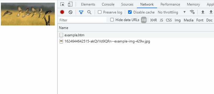
Note: above animation presents Google Chrome DevTools, when browser window size is changed (look on loaded images on the right list on window resize).
Practical example
In this example, we set the CSS width property to 100% and height to auto to create a responsive image. Optionally you can use max-width
Runnable example:
// ONLINE-RUNNER:browser;

<!doctype html>
<html>
<head>
  <style>

	.responsive-image {
		width: 100%;
		height: auto;
		max-width: 800px;
	}

  </style>
</head>
<body>
  <img class="responsive-image"
       src="https://dirask.com/static/bucket/1624644642515-akQVVd9QRn--example-img-429w.jpg"
       srcset="https://dirask.com/static/bucket/1624644642515-akQVVd9QRn--example-img-429w.jpg 429w,
               https://dirask.com/static/bucket/1624644642578-6pQmx29Ab5--example-img-600w.jpg 600w,
               https://dirask.com/static/bucket/1624644642609-mbQLqBEYJX--example-img-730w.jpg 730w"
  />
</body>
</html>
Note:
Copy source code to your local file, open it and resize your browser window to see the effect.
Used resources: