How to round div corners using CSS
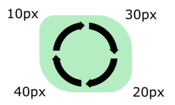
Did you know that you can assign different radiuses of curvature to different edges in an HTML div element?
Today, I'd like to show you how to easily round corners in HTML elements using CSS. 😊
Final effect:

There are several ways to round element depending on which corners you want to round.
Round each corner with the same value
In this solution, we use border-radius property with one value to round each corner of the div with the given value.
Runnable example:
// ONLINE-RUNNER:browser;

<!DOCTYPE >
<html>
  <head>
    <style>
      div {
        height: 100px;
        width: 120px;
        background-color: #b5edc2;
        border-radius: 25px; /* <---------- use this to round all corners in div */
      }
    </style>
  </head>
  <body>
    <div></div>
  </body>
</html>
Round diagonally opposite corners
In this solution, we use border-radius property with two values to round diagonally opposite corners of the div with two different values.
Runnable example:
// ONLINE-RUNNER:browser;

<!DOCTYPE >
<html>
  <head>
    <style>
      div {
        height: 100px;
        width: 120px;
        background-color: #b5edc2;
        border-radius: 25px 45px; /* <---------- use this to round the opposite corners */
      }
    </style>
  </head>
  <body>
    <div></div>
  </body>
</html>
Round each corner with a different value
In this solution, we use border-radius property with four values to round each corner of the div with a different value, clockwise.

Runnable example:
// ONLINE-RUNNER:browser;

<!DOCTYPE >
<html>
  <head>
    <style>
      div {
        height: 100px;
        width: 120px;
        background-color: #b5edc2;
        border-radius: 10px 30px 20px 40px; /* <----- use this to round all corners in div */
      }
    </style>
  </head>
  <body>
    <div></div>
  </body>
</html>
Custom rounded corners
In this solution, we use border-radius property with three values to round corners of the div in the following way:
- first value describes top-left corner -
20pxradius, - second value describes opposite top-right and bottom-left corners -
45pxradius, - third value describes bottom-right corner -
30pxradius.
Runnable example:
// ONLINE-RUNNER:browser;

<!DOCTYPE >
<html>
  <head>
    <style>
      div {
        height: 100px;
        width: 120px;
        background-color: #b5edc2;
        border-radius: 20px 45px 30px; /* <---------- use this to round corners*/
      }
    </style>
  </head>
  <body>
    <div></div>
  </body>
</html>
You can also manually specify which corner you want to round with given value like this:
// ONLINE-RUNNER:browser;

<!DOCTYPE >
<html>
  <head>
    <style>
      div {
        height: 100px;
        width: 120px;
        background-color: #b5edc2;
        border-top-left-radius: 25px; /* <----- top-left corner round      */
        border-top-right-radius: 30px; /* <----- top-right corner round     */
        border-bottom-right-radius: 40px; /* <----- bottom-right corner round  */
        border-bottom-left-radius: 50px; /* <----- bottom-left corner round   */
      }
    </style>
  </head>
  <body>
    <div></div>
  </body>
</html>
Circle div example
We can also use border-radius property with percentage values. In this solution I've set the property value to 50% to make a circle div.
Runnable example:
// ONLINE-RUNNER:browser;

<!DOCTYPE >
<html>
  <head>
    <style>
      div {
        height: 100px;
        width: 100px;
        background-color: #b5edc2;
        border-radius: 50%; /* <------ use this to make circle div (NOTE: height=width) */
      }
    </style>
  </head>
  <body>
    <div></div>
  </body>
</html>
Thanks for reading and see you in the next posts! 😊🔜