EN
CSS - outline with radius
23
points
In this article, we would like to show how to create an outline with a radius using CSS.
Quick solution:
div.element {
    border-radius: 3px;                   /* 3px internal outline radius          */
    box-shadow: 0px 0px 0px 5px #fff183;  /* 5px outline width with #fff183 color */
}
Alternative solution:
div.element {
    outline: 5px solid #fff183;           /* 5px outline width with #fff183 color */
    border-radius: 3px;                   /* 3px internal outline radius          */
}

Problem description:
outline does not provide outline-radius style property, so it is necessary to use some tricks (now we have 2025).
Problem solution:
used box-shadow style property with:
- blur set to
0, - spread set to some value,
and defined border-radius style property, give outline with radius effect.
Practical examples
Example 1
// ONLINE-RUNNER:browser;
<!doctype html>
<html>
<head>
<style>
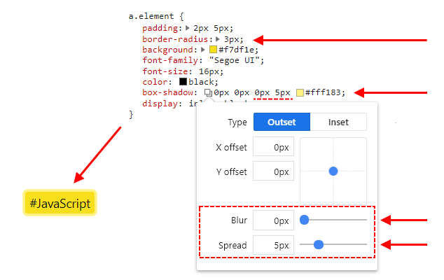
a.element {
padding: 2px 5px;
border-radius: 3px; /* <----------------------- required */
background: #f7df1e;
font-family: "Segoe UI";
font-size: 16px;
color: black;
box-shadow: 0px 0px 0px 5px #fff183; /* <------ required */
display: inline-block;
}
</style>
</head>
<body>
<a class="element">#JavaScript</a>
</body>
</html>
Example 2
// ONLINE-RUNNER:browser;

<!doctype html>
<html>
<head>
  <style>

    a.element {
        padding: 2px 5px;
        outline: 5px solid #fff183;  /*  <--------------- required */
        border-radius: 3px;  /*  <----------------------- required */
        background: #f7df1e;
        font-family: "Segoe UI";
        font-size: 16px;
        color: black;
        display: inline-block;
    }

  </style>
</head>
<body>
  <a class="element">#JavaScript</a>
</body>
</html>